Sunday, November 30, 2008

For my system I decided to create a geometric pattern in the style of a mandala, which, by definition, is "a concentric diagram having spiritual and ritual significance in Buddhism and Hinduism". I was drawn to the strong symmetry and lines of such systems and thought I could re-interpret them in an interesting way as a step -by-step system.

I was inspired by the triangular patterns of Sol Lewitt'a famous white sculptures, but decided I would create a central basis of half circles to my system to add some dimension and visual interest. I originally started with sheet #2 of my system, a square rotated 45 degrees. I then created a triangle measuring 1/2 a block, with the vertex of each at the center of each side of the square. This created a polygon: my pattern would progress from square to polygon continuously (the only disruption to this pattern would be the first sheet: I had to move backwards 1 in order to prevent sheet #10 from going off the page). After this initial polygon was created, I connected the outer corners to produce another square. The triangles growing outward from the squares to create the polygons increase in size as the system progresses: the first is 1/2 a square high, the second 1 square, then 2, then 3. I connected inner triangles to the outer squares systematically to provide more balance within the system. The result were manalic geometric patterns that have an interesting quality: the culmination of several lines at each point create a dynamic "glowing" effect. For this reason, I decided after two trials that color would diminish that effect. I instead colored my system as simply as possible, with a gold marker. I found this actually accentuated the effect.


pop rocket


In this project i wanted to take the integrity of the pop cans and make a rocket ship out of the cylinder shape of the cans. I thought it would be a cool effect if i was able to make curls at the end of the ship to represent smoke coming out of the end. I also wanted to make sure that all the colors coordinated with which thing it was representing so that the viewer wouldn't be lost if they were looking at it.


Tuesday, November 25, 2008

Graph Paper System


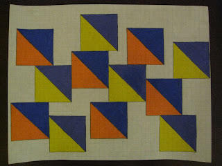
For my systems project, I took a suggestion that Professor Fick made to me and added to and elaborated it. The rules for this system are quite simple:
1) Go from left to right on a horizontal piece of graph paper.
2) The first page begins with one-by-one triangles (two sides each take up one box, the hypothesis cuts through one box) and each subsequent page adds one more box to each side (page two consists of two-by-two triangles, page three consists of three-by-three triangles, and so on).
3) There can be no stray triangles; every triangle must touch at least one other triangle.
4) Once you reach the edge of the right side of the page (i.e. the last full box on the right side of the page), you can draw more triangles up and/or down along that edge, but you cannot go backwards toward the center and left side of the page.
5) Use purple, yellow, blue, and orange to enhance the designs.

In this sequence of 10 pages, each page looks pretty different because I imagined each page as how different people might approach creating the systems. The use of the same colors for each page helps maintain cohesiveness throughout.

Monday, November 24, 2008

Art at Duke

I interviewed a couple friends about art around campus.  They both had similar ideas about the art at Duke.  The common theme in their interviews is that art is a hidden beauty here that should be more out in the open.

ZAK STEMER


RYAN CLARK


Friday, November 21, 2008

The Role of Art and Design at Duke


For this project, I interviewed a few of my friends and compiled all of their responses into one video. I received some pretty varied answers, but the overall consensus seems to be that there is not very much art around campus, or at least not much of which my friends are aware. However, I am not sure that it is missed much. Because Duke is not an art school and does not have as strong an art department as some other schools, it seems as though most of the students who come here do not really think about art and whether or not it is present around campus. The reason most students come to Duke is to get a good education, which will hopefully lead to a "successful" job. Not many people have time to focus on art when they are trying to become doctors or get into graduate school. For those who have an interest in art, art tends to take a backseat to academics and good grades, acting simply as a sort of hobby. If art does not hold priority in students' lives, then how can we expect art and design to play a large role on Duke's campus? Please watch the video to learn more about students' feelings and understanding of visual arts at Duke.

Art and Design at Duke

For this documentary assignment, of Art and Design at Duke, I found it fascinating to find out what my friends really thought about art in and around duke. These are some of the questions that I asked, and my friends replies:

Arthur Leopold: Should there be more public art at duke?

Gabe Bender: What is the most important work of art, on the Duke Campus, other than the work found at the Nasher Museum of Art?

Orfeus Shankle: Where would you like to see more public art?

Arielle Silverman: What kind of public art would you like to see on campus?

Rachel Diamond: How can public displays of art at Duke be improved?

After these interviews, it is evident that there is art work on campus that students recognize and know about. However, Students do want to see more art work in and around campus and make it more noticeable in their everyday lives. 

Where is visual art at Duke?

Where is art at duke?

That was the main theme for my project. I went to various sites and took short clips of the art present and finally decided to ask different people where they would go to look for art and how much importance they felt was given to visual arts in general. The overall view was that art was limited at Duke in both taking art courses as well as looking for art around campus. They felt that Duke was not the ideal place to pursue a Visual Arts major and they had to go looking for the art, it did not necessarily come to them. My interviewees were all genuinely interested in art, whether it was in photography, dance, music or paintings and they all felt that art at Duke has to reach out more to its students.

Art on Campus....


People's opinions......

cont....

cont...