Thursday, December 11, 2008


In this project my intent was to have the squares expand as the system grew. As the stages went on i started to see a pattern form within the sequence of the pattern that I was following. If i were to continue this system for 20 steps i would see more and more things. I also thought that the colors worked very well. I think this piece would also work better on a larger scale paper so that you could really get the feel for its translusent being.

Wednesday, December 10, 2008

Art on Duke's Campus


This final video project allowed me to combine my passion for art and basketball by exploring different types of art both inside and outside buildings on the athletic quad.  I was able to talk to multiple students about their impressions of art on Duke's campus.  I was also able to highlight some unique examples of art used by the basketball program to showcase both past and current players.

Friday, December 5, 2008

Paper Hearts

"What is important is to spread confusion, not to eliminate it. Take me, I am the drug. Take me, I am the hallucinogenic." -S. Dali
When working on an art piece, I always refer to this quote. I find my work to be concentrated upon false memories, etc. Therefore, this project was exceptionally hard for me.

In viewing Sol Lewitt's artwork, I found most of his work to be fairly dry and not very visually engaging. His art pieces all required taking a step back for a holistic view, instead of concentrating upon individual parts. However, I found his most interesting pieces to be those that involved paper folding -- and that is where I drew my inspiration.

A graph paper system does not necessarily have to be a 2-dimensional display. I wanted to give my project more of an interactive, 3-dimensional, engaging feeling. Therefore, I turned to the Japanese art of origami and created an educational system for folding paper hearts.

Before starting my project, I had to physically fold a paper heart in order to remember the appropriate steps, and to choose 10 "steps" that would be most informative to the viewer. Therefore, I did a few preliminary sketches:

prelim sketches


From then on, I created my instructional system. I feel like my project does not need an explanation -- but the explanation is in the project. The directions should all be there on the first page, and viewers should be able to look at this system and derive from it the steps to folding a miniature paper heart out of an 8.5"x11" standard sheet of paper. The first page is the first step and visually explains the process, and remains the only 2D page of this project.

the first page


step 5 From then on, I approached the system by visually presenting the physical steps represented by the first page. As seen on the left, I numbered the "steps" so that the viewer can follow along the process as it is presented along a wall. The systematic approach is entirely based upon the instructions on the first page. This is an example of step 5 of the process, and should relate to step 5 numbered on the first page.

step 9Here is step 9 of the process. I arbitrarily colored the borders and the creases in order to emphasize the 3-dimensional quality of the paper. Sol Lewitt has several pieces in which he randomly creates marks upon a large piece of paper. I utilized one of the techniques I saw in a collection of his art pieces to color my paper heart process.

I hope I managed to achieve what I believe is one of Sol Lewitt's main artistic effects -- the viewer must take in this system in its whole in order to grasp the full experience. In the end, I also hope I managed to bring across a visually stimulating, fun, interactive, 3D approach to this system project.

Wednesday, December 3, 2008

Expansion of a Triangle

For this project, I decided to look at the ways a triangle could be transformed by one changing its dimensions one square of the grid at a time. I began with this red 4 by 4 triangle in the upper right hand corner, and then following the rules (which I explain later), form this progression of triangles modeling Sol Lewitt's work.


The initial pattern continues on to form this trio of blue triangles:


The project actually would have worked better if we had one large grid to work on like a wall in Sol Lewitt's art, but since I was constrained
to the paper, I had to make adjustments. I will begin with the instructions for a large continuous grid, then tell how I made adjustments after.

1. Begin with 4 x 4 right triangle in upper left hand corner, calling the top point of the triangle the pivot point, because the rotation of the triangle hinges on this point. The other points that do rotate are called the left point and the right angle point, respectively.

2. The movement of the entire triangle from one triangle to the next is (in theory) always the same. The pivot point of the new triangle is two squares down and two squares to the left of the left point of the previous triangle.

3. The rotation of the triangle is controlled by the successive movement across the grid and how many grid squares the right angle point and the left point move. Moving from one triangle to the next is essentially a copy of the last triangle in its new position (as determined by the movement rule). This copy is then rotated and expanded, so that the right angle point is moved down and left one square, and the left point is moved right and up one square.

4. You continue this pattern until you develop the sloping triangle as represented by my project.
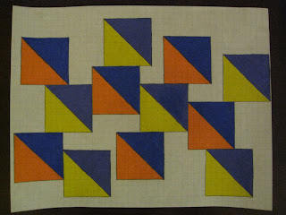

5. For the color scheme, I decided to begin with red, and moved through the range of colors until the last triangle. The color changes quickly in the beginning, as the triangle rotates rapidly, but then slows down with different shades of dark blue and purple as the triangle gets bigger, and its rotation is less noticeable. I decided to end with pink because I felt this showed the continuum of the color spectrum, and how this pattern could be continued eternally, eventually producing a very large upright triangle.

I had to modify some of the rules for my project, such as the movement rule, so that the triangles could fit neatly on the pages. Also, if the pattern was done on a large grid, the triangles would be moving downward continuously, instead of me restarting the pattern at the top right of the paper after it reached the bottom of the previous page.

Here is the final product after ten pages of the progression:


Art at Duke

For my videos, I asked people different questions all dealing with art at Duke. Some a lot to say and others not much at all. I asked "Do you think art is important at Duke?", "What is your favorite piece of art at Duke?", and asked them what their thoughts were on the Nasher and the graffiti bridge. Several of my random interviews were damaged and were without sound so I don't have a full representation of my work; however, I did gain a better understanding of the public's feelings for the arts at Duke. Art at Duke is not just a painting in the Nasher and it is not a painting on the graffiti bridge. Its more about the feeling and passion behind the art. If someone feels like expressing themselves and leaving their mark by spray painting small toasters around campus (look for them!), then that is art. If people think a bunch of soda cans cut into a hanging design is art, then why not? As I type this, I am on the first floor of the Perkins library in a comfy chair that sits across from a huge poster hanging on the wall. It is a collage of images involving a mix of paintings, music record covers and pictures of Duke happenings- all countered by a large profile of a woman's head. The poster features a quote by Miles Davis which says, "Don't play what's there, play what's not there." I think the arts at Duke are definitely important but right now it is only a small whisper. With more support and visibility, it will be more prominent. 

Tuesday, December 2, 2008

Art and Design at Duke

I interviewed several students-a mix between sophomores and juniors. I received mixed responses, but found that most students wanted more art here at Duke.

How important is art and design at Duke?


What is the most important work of art on the Duke Campus?


Should there be more public art at Duke? if so, where?

What kind of public art would you like to see on campus?


These are places on campus that have art. Some are mentioned by the people I interviewed, and some are ones I noticed. 
(outside Science Drive, inside Bio. Sci. Building, Trent, hallway leading to Perkins, BC, Kilgo bench, outside West bus stop)


Monday, December 1, 2008

Public "Student" Art at Duke

I interviewed a few friends to see their opinions on public "student" art at Duke. The overall consensus was that the only two locations at Duke the "Graffiti" Bridge from East to West and the Dorm Benches. I personally think that is one of Duke weakest qualities because Duke should supports students creativity with public spaces to display art.


Sunday, November 30, 2008

For my system I decided to create a geometric pattern in the style of a mandala, which, by definition, is "a concentric diagram having spiritual and ritual significance in Buddhism and Hinduism". I was drawn to the strong symmetry and lines of such systems and thought I could re-interpret them in an interesting way as a step -by-step system.

I was inspired by the triangular patterns of Sol Lewitt'a famous white sculptures, but decided I would create a central basis of half circles to my system to add some dimension and visual interest. I originally started with sheet #2 of my system, a square rotated 45 degrees. I then created a triangle measuring 1/2 a block, with the vertex of each at the center of each side of the square. This created a polygon: my pattern would progress from square to polygon continuously (the only disruption to this pattern would be the first sheet: I had to move backwards 1 in order to prevent sheet #10 from going off the page). After this initial polygon was created, I connected the outer corners to produce another square. The triangles growing outward from the squares to create the polygons increase in size as the system progresses: the first is 1/2 a square high, the second 1 square, then 2, then 3. I connected inner triangles to the outer squares systematically to provide more balance within the system. The result were manalic geometric patterns that have an interesting quality: the culmination of several lines at each point create a dynamic "glowing" effect. For this reason, I decided after two trials that color would diminish that effect. I instead colored my system as simply as possible, with a gold marker. I found this actually accentuated the effect.


pop rocket


In this project i wanted to take the integrity of the pop cans and make a rocket ship out of the cylinder shape of the cans. I thought it would be a cool effect if i was able to make curls at the end of the ship to represent smoke coming out of the end. I also wanted to make sure that all the colors coordinated with which thing it was representing so that the viewer wouldn't be lost if they were looking at it.


Tuesday, November 25, 2008

Graph Paper System


For my systems project, I took a suggestion that Professor Fick made to me and added to and elaborated it. The rules for this system are quite simple:
1) Go from left to right on a horizontal piece of graph paper.
2) The first page begins with one-by-one triangles (two sides each take up one box, the hypothesis cuts through one box) and each subsequent page adds one more box to each side (page two consists of two-by-two triangles, page three consists of three-by-three triangles, and so on).
3) There can be no stray triangles; every triangle must touch at least one other triangle.
4) Once you reach the edge of the right side of the page (i.e. the last full box on the right side of the page), you can draw more triangles up and/or down along that edge, but you cannot go backwards toward the center and left side of the page.
5) Use purple, yellow, blue, and orange to enhance the designs.

In this sequence of 10 pages, each page looks pretty different because I imagined each page as how different people might approach creating the systems. The use of the same colors for each page helps maintain cohesiveness throughout.

Monday, November 24, 2008

Art at Duke

I interviewed a couple friends about art around campus.  They both had similar ideas about the art at Duke.  The common theme in their interviews is that art is a hidden beauty here that should be more out in the open.

ZAK STEMER


RYAN CLARK


Friday, November 21, 2008

The Role of Art and Design at Duke


For this project, I interviewed a few of my friends and compiled all of their responses into one video. I received some pretty varied answers, but the overall consensus seems to be that there is not very much art around campus, or at least not much of which my friends are aware. However, I am not sure that it is missed much. Because Duke is not an art school and does not have as strong an art department as some other schools, it seems as though most of the students who come here do not really think about art and whether or not it is present around campus. The reason most students come to Duke is to get a good education, which will hopefully lead to a "successful" job. Not many people have time to focus on art when they are trying to become doctors or get into graduate school. For those who have an interest in art, art tends to take a backseat to academics and good grades, acting simply as a sort of hobby. If art does not hold priority in students' lives, then how can we expect art and design to play a large role on Duke's campus? Please watch the video to learn more about students' feelings and understanding of visual arts at Duke.

Art and Design at Duke

For this documentary assignment, of Art and Design at Duke, I found it fascinating to find out what my friends really thought about art in and around duke. These are some of the questions that I asked, and my friends replies:

Arthur Leopold: Should there be more public art at duke?

Gabe Bender: What is the most important work of art, on the Duke Campus, other than the work found at the Nasher Museum of Art?

Orfeus Shankle: Where would you like to see more public art?

Arielle Silverman: What kind of public art would you like to see on campus?

Rachel Diamond: How can public displays of art at Duke be improved?

After these interviews, it is evident that there is art work on campus that students recognize and know about. However, Students do want to see more art work in and around campus and make it more noticeable in their everyday lives. 

Where is visual art at Duke?

Where is art at duke?

That was the main theme for my project. I went to various sites and took short clips of the art present and finally decided to ask different people where they would go to look for art and how much importance they felt was given to visual arts in general. The overall view was that art was limited at Duke in both taking art courses as well as looking for art around campus. They felt that Duke was not the ideal place to pursue a Visual Arts major and they had to go looking for the art, it did not necessarily come to them. My interviewees were all genuinely interested in art, whether it was in photography, dance, music or paintings and they all felt that art at Duke has to reach out more to its students.

Art on Campus....


People's opinions......

cont....

cont...

Systematic Design

For my conceptual project, where we had to create a design that uses a system with inspiration from Sol Lewitt's work, I decided to create a system of an increasing pattern design. I wanted to make my pattern begin from the center and work its way out, so that there would be a center point on the design. Therefore, I began with a simple four squares in the middle of the graphing paper. 

After this start point, I began to grow my design from the center diagonally from each side. I increased the design outwards by two squares off of each point of the original starting square.

Once those diagonals were in place, I created a box around that enclosed the diagonals. This pattern continues up until my last 10th piece... 
Examples of a few other pieces within the design, and my 10th piece:
   
The color scheme that I chose came from a few experiments. I wanted to create the feel that the design was growing outwards from the page, to create depth from the center. I first tried dealing with red, orange, and yellow, but I realized that no matter how hard I worked on it, it did not really create the feel of depth that I was hoping for. Therefore, I moved onto the colors of green, blue and purple. I felt that these colors all are based off of relatively the same hue, and work well together. I still wanted to create some form of depth, so that is when I made the choice to make the color really dark first, and then continue the pattern with the same color, except for really light. I felt that the darkness of the color followed by the lightness of the color created depth. This pattern continues then, for each color following green. 

Representation of Art at Duke

I decided to interview my friends about the representation of art at Duke, and the interest they thought people took to it.  I did not include all of the interview, but as evidenced by the last clip, art is apparently important to some students more than others.  Matt Davis is an engineer and does not even consider art at Duke, and only really has any idea of art at Duke through his friends.  My friend Ellary also had a hard time coming up with art pieces that she could name off the top of her head, which is implies a lack of visibility for the few works of art that we do see at Duke.  She is more interested in Performance art, but even in this category, as she says, many times the actors are met with a small audience.  To me, art has a small representation here at Duke, and as Ellary says, even the "artsy" students must it seek out.  


Gina & Laura - Art at Duke


Laura and I worked collaboratively for this project to get a feel for how people within the Duke community see art on campus, the university's receptiveness to art, and where they think art should be better represented. Responses varied, but the overall responses we recieved were in favor of more student art, installations, public art, etc. It seemed obvious from our interviews that students' perceptions of Duke are that it is a university campus severely lacking in innovative and thought-provoking artwork.

Gina: Duke is not particularly known as an artistically liberal, creative, art-embracing campus, and unfortunately, some of these external stereotypes actually hold true. Although certain areas of campus are decorated with student-created advertisements, poltical beliefs, or random blurbs of graffiti (namely, the bridge to east campus), Duke's public artwork predominately remains the austere, memorial-type statuary or portraiture. As Babs so eloquently stated in her interview, this campus is in desperate need to art that can shock, inspire, or simply to make campus a more visually-stimulating, artistic environment.

Laura: I actually was not shocked by the student response in our interviews. Art is not a very prevalent element on the Duke Unversity campus. I feel like Duke ought to make more of an effort to showcase student art -- especially in more public areas such as the main quad, bryan center, east campus student union, and even the libraries. Art is a way to broaden minds and has various uses: breaking down social conventions, asking unanswered questions, etc. I hope that we, as students and members of the Duke community, can act upon this.

conceptual project


I chose to my conceptual project about aligned objects that create a face. With each new page, something on the face moves. This concept allows others to think of what they would tweak on the face. The face generally stays the same; however, some parts are altered. I chose to move the eyes, mouth, teeth, and eyebrows. Different color schemes consisting of a primary and secondary color were used and the part that was changing had one color while the rest of the face had the other. This enabled the viewer to focus in on the change.
The face is constructed in a patterned format that was followed for all ten pages. 
-Start by making 4 faint guidelines on the paper vertically. These lines are the outline of the face. All parts are within the lines.
1st-5 boxes in from left
2nd-8 bxes in from left from 1st line
3rd-8 boxes from left from 2nd line
4th-8 boxes in from left from 3rd line
-2 eyebrows 7 blocks  down from top, 1 block deep, 8 blocks wide
fit between 1st&2nd and 3rd&4th guidelines
-2 eyes 3 blocks down from eyebrows. 3 blocks height, 4 blocks width
count 2 in from 1st&2nd and 3rd&4th line
-eyeballs 2 block height & width, in center of eyes
-nose- between 2nd&3rd line 4 blocks down
2 in from 2nd&3rd guidelines. triangle shape with hypotenuse on top.
4 block top length, 2 block width
-mouth- the middle part is 8 blocks down from nose. 8 blocks wide 2 blocks height
between 2nd&3rd lines
the sides of the mouth are two diagonal lines covering 4 blocks on bottom line, 3 on top.
-teeth- two teeth, 4 block squares.  with 2 blocks in between

Thursday, November 20, 2008

visual art @ duke

For my video project, I wanted to document existing art, student reactions to art on campus, and potential spaces for new art. Each of these topics is covered in a separate part. I interviewed three of my friends, all of whom have different perspectives on the arts, but who ended up saying similar things: we need more art on campus, especially student art!


The Arts at Duke

For my video documentary on the arts at Duke I decided to interview a friend of mine, Bri Connolly.  Bri is a civil engineering major, but is also known around campus for her artistic abilities.  Bri has not taken an arts class at Duke yet, but she manages to stay busy doing artwork around campus.  The interview was done in Duke's Coffeehouse in front of a mural Bri completed this semester.

What is the most important piece of art at Duke?


What art have you done at Duke?


Where should more public art should be seen?


How important is art/design at Duke?  And do people care about it?


The mural at the Coffeehouse.


The mural at the Central Campus apartment.


As a side note: there are a lot of neat murals all over the Coffeehouse, so I took a quick video of those too:


Wednesday, November 19, 2008

Probability and Growth


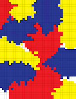
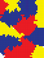
My system is based on a very simple, yet dynamic series of rules.  When thinking about what type of system I wanted to portray, I knew I wanted it to involve randomness and probability; I wanted the system to have a different outcome each time even if the exact same rules were followed by everyone with the same assumptions. 
I started by placing rectangular blocks of the three primary colors in random locations on the graph paper.  Each page after that, the blocks attempted to 'expand' by filling in the spaces next to them (horizontally and vertically) with their color.  However, each color was not guaranteed that it would 'take over' the adjacent blocks; the colors were assigned a probabilities as to whether they would succeed.  
The probabilities were assigned at random, based on my preferences.


page 1

Any color vs. White (85% chance of take over)
Blue vs. Red (55% chance of take over)
Blue vs. Yellow (75% chance of take over)
Red vs. Yellow (60% chance of take over)

From these probabilities we would expect to see easy expansion by the colors until they ran into one another.  Once this occurred, we would see yellow lose ground pretty steadily to both red and blue; we would also expect to see blue slowly advance into red's territory.  However, none of these outcomes are guaranteed as all expansion is left up to chance.

To determine each individual outcome I used a random number generator (link), with limits of 1 and 100.  If the number generated was less than or equal to the percentage assigned, the color would expand; if not, the other color would succeed (*not applicable to white).  The process of determining each outcome was long and tedious, however, I like the outcome.

page 2


page 3


page 4

page 5

page 6


page 7


page 8


page 9


page 10

Hopefully I did not make this sound too complicated and its easy to follow.
Heres a short video of the progression: